shopper's BEAUTY
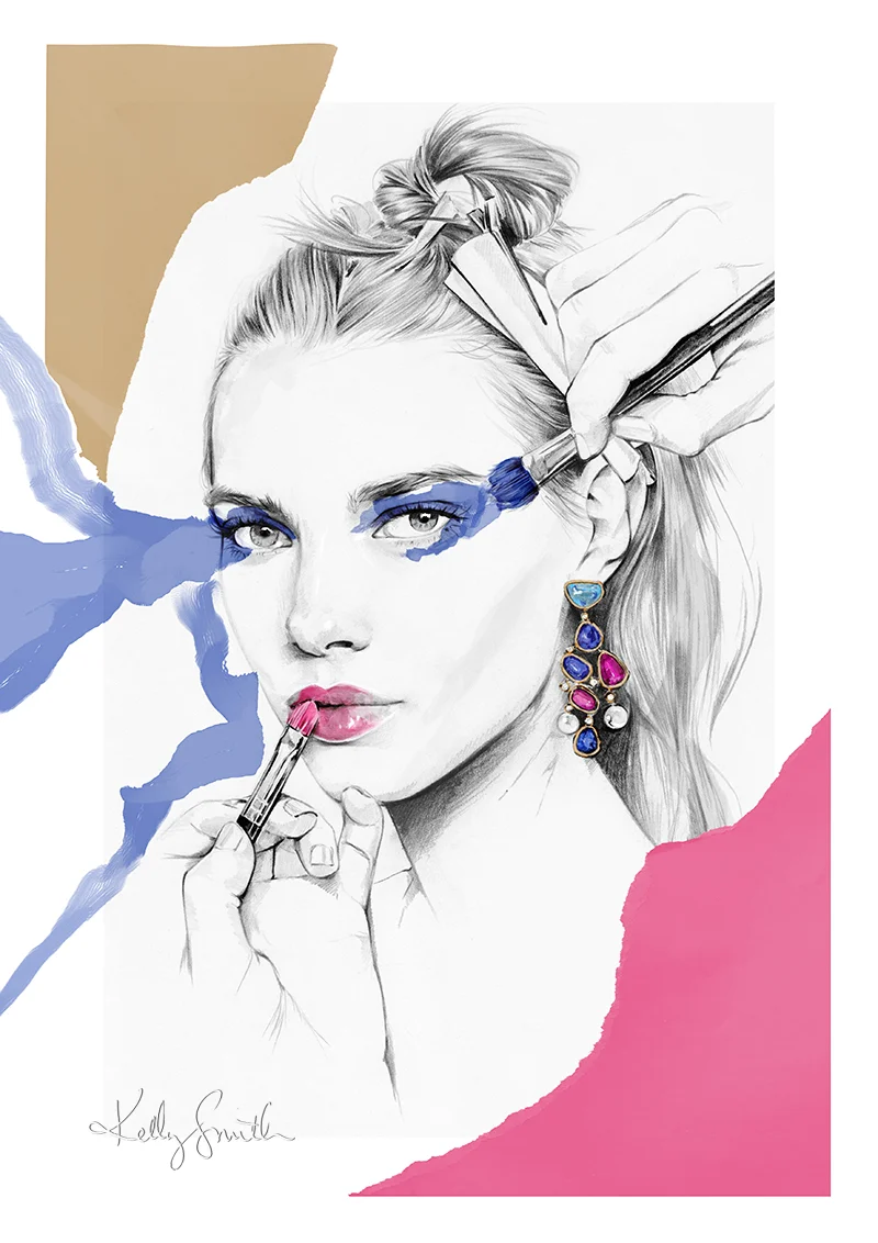
A few little beauty illustrations for Canadian retailer Shoppers Drug Mart, including make up smears, lips and face chart!
See the final product below.
le JARDIN
A new personal work for my folio and store!
Inspired by the song 'Golden Afternoon' from my forever favourite, 'Alice in Wonderland' this piece is all about lazy sun-kissed days spent amongst the flowers and fluttering creatures found in any garden.
You can find prints here: www.birdyandme.com.au/shop
CHANTECAILLE
Some new work for luxury beauty brand, Chantecaille.
To coincide with the release of their F/W 2017 collection, Chantecaille invited a number of artists to take part in their 'Save the Forest' campaign, taking inspiration from the product within the collection, along with the fundamental elements of the brand identity; natural ingredients, beautiful botanicals, and lush wilderness.
The F/W collection also includes a very special eye palette, designed to both reflect and raise awareness for a carefully chosen environmental cause. This year, Sylvie Chantecaille, the creator of the brand, was inspired by the incredibly beautiful, but endangered, habitat of the Congo and its last remaining silverback gorilla population.
(Fun fact: the photograph used on the palette is one of Sylvie's own.)
It's an astonishing figure that 50% of the world's rain forests are destroyed every minute.
As someone who happens to live in one of the most naturally beautiful parts of the world, Tasmania, this project was close to my heart. (Temperate rain forests comprise roughly 10% of Tasmania, 598,000 hectares, which is the largest coverage in Australia.)
It's undeniably important that we do everything we can to protect and nurture our natural forests and landscapes.
Taking my inspiration from the lush greenery of the forest, along with the gorgeous colours of the palette in their rich, earthy tones, I wanted to create a sort of super-chic wood nymph, standing on the forest floor, surrounded by, and holding close to her, foliage and products from the collection. Along with the sense of beauty and sophistication that comes with the Chantecaille brand, my aim was to portray the idea of new life; which, for the rain forest, is all about fresh, bold colour, unfurling shapes but it also has a certain fragility. It was important to me to show in some way that we have to nurture the environment as best we can.
To make it even more alluring, a portion of the proceeds from the 'Save the Forests' eye palette will go directly to the Rainforest Alliance, an organisation that works to protect both the precious forests and the vast array of wildlife and endangered species' that inhabit it.
Clicking on 'add to cart' never felt so rewarding!
You can read more about the campaign by heading to the Chantecaille website here.
Australian shoppers can shop the product in Mecca stores nationwide or online at Net-A-Porter.
PINK PRADA DISCO BALLS
I spotted these Prada (SS '16) earrings in a magazine a few years ago while making a mental note to include them in an illustration because they were just so. damned. fun.
In classic Kelly style, it has taken me over two years to do just that. But, better late than never as they say!
These were the perfect baubles to add to my jewellery portfolio, if not to my physical collection - I'm not sure they're even purchasable anymore. Alas...
BVLGARI BEAUTY
Beauty piece for my folio, featuring Bulgari jewels made with stunning rubellites, tanzanites, aquamarines, diamonds and Akoya pearls.
CLARINS FLORAL BEAUTY
Last year I had the pleasure of working, again, with Clarins Australia on a series of floral-inspired imagery for their Winter '17 gift promotion. (You might remember our previous collaboration, but if not, click HERE.)
Taking inspiration from key product notes of Rose, Chamomile, Lavender and Hydrangea, as well as the incredible natural beauty of some of the most intoxicating places in the world, we came up with a series of colourful, blooming beauties exclusive to different retail partners to display in store throughout the past few months.
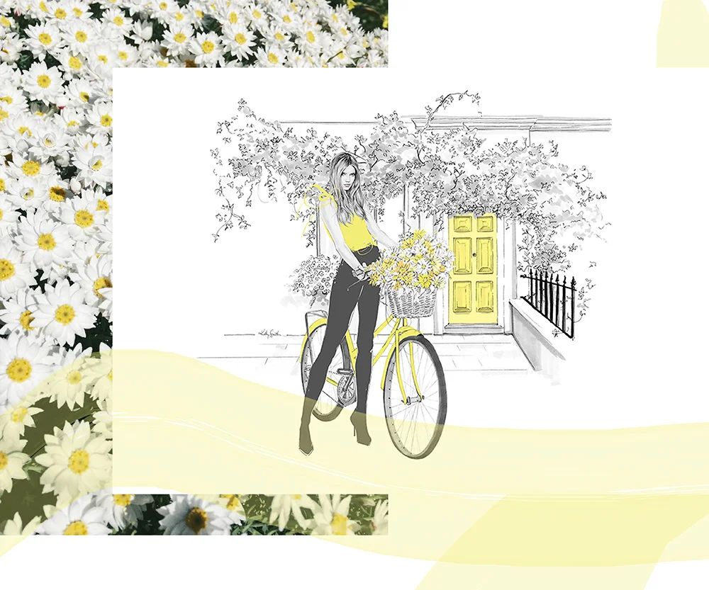
See below for the current "Pink" image, which you can see in-store at Myer this week, along with the other floral fantasies. (I think my fave might be the basket full of daisies AKA happiness!)
PINK - The chic London Florist with an armful of David Austin roses.
YELLOW - The Summery Sunday bike-rider in Primrose Hill with a basket full of daisies.
RED - The sophisticated shopper with a box of classic roses in the signature Clarins hue.
BLUE - The lady on vacanza, soaking up the Italian sunshine, surrounded by sparkling water and hydrangeas in the brightest azure blue.
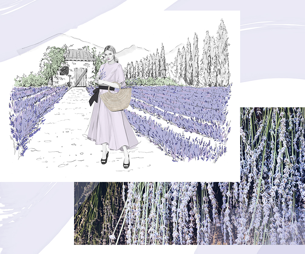
PURPLE - The Provençal flower farmer in a rolling Lavender field.
VANITY
I had originally intended this piece to be something of a throwback to my 2009 illustration 'Scented' - one of my most popular prints ever - a 'Scented 2.0' if you will.
It quickly evolved, however, into more a still life featuring some of my favourite beauty products; scented in more than ways than one!
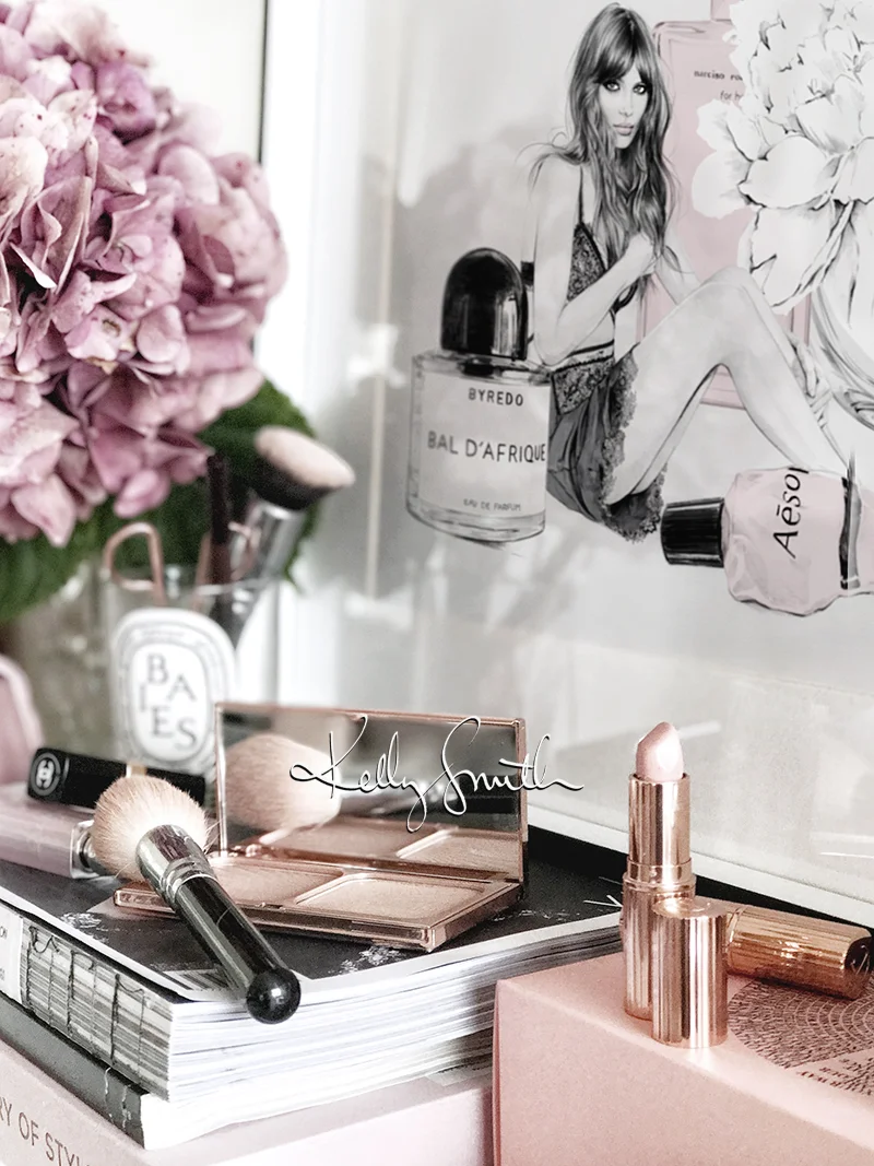
Aesop's 'Resurrection Aromatique' hand balm, which smells so delicious I could eat it, is also secretly used by my husband (I'm a regular ol' wikileaks over here!)
My 'Baies' candle from Diptyque has long since burnt out, but using it as a vase for the most fragrant of peonies is another way to admire its beautiful design.
Also featured are Charlotte Tilbury's 'Very Victoria' - hands down the best nude/beige-rose lipstick - and Chanel's 'Coco Mademoiselle.' I find so many Chanel perfumes too strong for my senses, and as much as I would love to say I was a fan of the iconic 'No.5' it's just too overpowering for me. 'Mademoiselle' is by far my favourite; powdery and soft, but also a little bit sexy.
My other go-to is BYREDO's 'Bal D'Afrique.' I first discovered BYREDO a few years ago while browsing the beauty department at Liberty London where I was immediately seduced by the edgy beauty of 'Rose Noir' and wore it, quite literally, every single day until it ran out. When I popped into a store to re-purchase it I tried 'Bal D'Afrique' on a whim, and I jumped ship faster than you can say 'WRAP IT UP, WENDY!'
As you can see from the image above, although not featured in the illustration, I am also a huge fan of Charlotte Tilbury's beauty products. I was converted on a visit to their counter when I purchased ol' Vic and was given a few samples of 'Magic Night Cream,' which is one of the best products I have used for my skin - and even better, it can do its thang while I sleep!
I also use CT for my brows, lashes, and even my highlighter/bronzer combo. ALL OF THE THINGS.
Anyway, none of this is sponsored, just heavily endorsed by my face and skin!
I do hope you enjoy this latest illustration, along with a peek at what's on my vanity.
It did start out as 'Scented 2.0' I promise. But what's a CT lipstick and classic white peony between friends?!
'Vanity' is available as a limited edition print in my store here: www.birdyandme.com.au/shop
THE LONDON LOOK
I recently worked on a self-initiated beauty project in cahoots with Coty PR to celebrate the 15th anniversary of Rimmel London's partnership with the iconic Kate Moss - my absolute favourite of all the Supers!
The side aim of this project was also to teach myself how to create an animated gif in Photoshop, a skill that will come in extremely handy for a gif-hound like me. (Not so great, perhaps, for the people on the receiving end of my phone texts - sorry in advance, friends!)
The 6 shade collection of reds and nudes, designed by Kate herself, was the perfect subject matter as I was able to incorporate each beautiful lip colour into a separate frame.
Unfortunately, the nudes seem to have been a little lost in translation when exporting the file, however I've heard it's pretty tough to get a perfect colour transition in an animated gif...
I was happy with my first attempt, regardless! I hope you guys like.
Illustration is based on an amalgamation of multiple Rimmel campaigns photographed by Craig McDean, Solve Sundsbo and Inez and Vinoodh over the last 15 years.
