PINK, PEONIES + DIOR

To shop limited edition prints like 'La Petite Fleur' above, click here: www.birdyandme.com.au/shop
BEAUTY & THE BEAST

It's come to the point in my fairy tale collection where I've started saving the best for last.
While it's so hard for me to play favourites, as so many different stories appeal to me for different reasons, 'Beauty and the Beast' is one of those stories that just gives me butterflies.
Admittedly, it's a tale that I never connected with until I saw the Disney adaptation in 1992. Prior to that, I think I had seen an 80s soap-style version that starred Linda Hamilton – which didn't exactly grip me. Of course, we can never forget Shelley Duvall's 'Faerie Tale Theatre.'
However, from the very first moment I laid eyes on that shiny, big screen and listened to a host of villagers sing 'Bonjour!' to each other I was hooked. I still vividly remember turning to my Mum half-way through 'Be Our Guest' and requesting we 'buy this on video as SOON as it comes out!'
It was love.
Over the past 25 (gulp!) years I have devoured other editions of the story - most notably the French live-action film starring Léa Seydoux as Belle and Vincent Cassell as the Beast.
This version is much more in keeping with the original tale and I highly recommend watching it. It's visually stunning.
I also have to make mention of Disney's current live-action remake. I admit - I've already seen it three times. On first viewing I wasn't sure what I thought of it, having already seen (and loved) such a high quality live-action version of the story, but also being so familiar with the original 1992 version.
However, on subsequent viewings, I was able to take it in without any pre–conceived ideas and just enjoy it for what it was.
I digress! Back to the illustration. I started my interpretation of this story almost a year ago!
I had some initial ideas of how I wanted to capture it in illustrated format, but I kept putting it off, wanting the idea to have time to grow if needed - and I was never entirely happy with what I was doing. To try to encapsulate such a delicately beautiful and layered story into just one image is not as easy as it sounds. There are so many themes within 'Beauty and the Beast' - not just the love story between Belle and the Beast, but also those of jealousy, greed, materialism and the superficial manner in which we can judge each other. There was also the symbolic nature of the rose.
Some interpretations of the original tale by Gabrielle-Suzanne Barbot de Villeneuve are quite grotesque. Others are beautiful, and opulent. I think we all tend to associate fairy tales with the fantasy of royalty and beauty. However, they always hark back to darker roots; stories created to scare children into making good moral choices. Which is why it can be so hard to truly depict each story.
But, strip it all back and no matter which way you look at it, this story is ultimately about love; lost, platonic, coveted, and deep, true love. Which is why I decided to focus my illustration on the enigmatic rose at the heart of the story - with a side of couture as always.
Depending on which version you want to read into, the rose symbolises the Beast's love for his previous wife; his grief and guilt at her death which was (inadvertently) caused by his own callous and beastly nature, but also the love that Belle's father feels for his daughter, as it is this rose that he plucks from the Beast's garden to give to Belle when he returns home. A rose is what Belle covets most, when all of her sisters crave jewels and finery. In the Disney version, the rose is a physical reminder of the Beast's curse, representing the time he has in which to break the curse that befalls him, before the last petal falls.
One of my favourite parts of researching this tale was seeing how their relationship is depicted in different variations of the story. I wanted to focus on the progression of their relationship, and in doing so fell back into the original tale. Belle, having taken the place of her father, sits down to an opulent dinner with the Beast each night. After every meal he asks her to marry him, a proposal she refuses. However, gradually, as she begins to know him, and to feel empathy and gratitude toward him for the kindness that he shows to her, she starts to see his true character beneath the beastly guise, and falls in love with him.
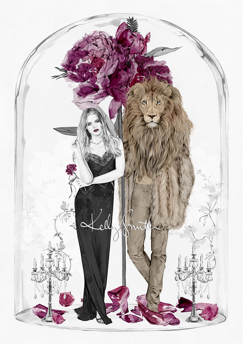
Chic as ever, dressed in Chanel-inspired lace, Belle and a Versace-clad Beast are ensconced inside the glass cloche, standing amongst opulent candelabras and the peony roses that represent their budding love affair.
The latest in the collection, 'Beauty and the Beast,' is available in my store now in limited A3 + A2 editions until sold out.
SHOP HERE: www.birdyandme.com.au/shop
CLARINS FLORAL BEAUTY
Last year I had the pleasure of working, again, with Clarins Australia on a series of floral-inspired imagery for their Winter '17 gift promotion. (You might remember our previous collaboration, but if not, click HERE.)
Taking inspiration from key product notes of Rose, Chamomile, Lavender and Hydrangea, as well as the incredible natural beauty of some of the most intoxicating places in the world, we came up with a series of colourful, blooming beauties exclusive to different retail partners to display in store throughout the past few months.
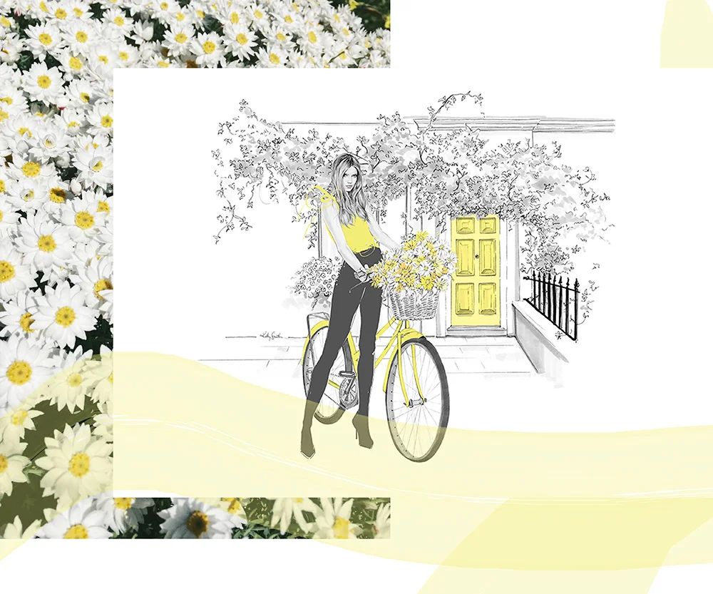
See below for the current "Pink" image, which you can see in-store at Myer this week, along with the other floral fantasies. (I think my fave might be the basket full of daisies AKA happiness!)
PINK - The chic London Florist with an armful of David Austin roses.


YELLOW - The Summery Sunday bike-rider in Primrose Hill with a basket full of daisies.

RED - The sophisticated shopper with a box of classic roses in the signature Clarins hue.


BLUE - The lady on vacanza, soaking up the Italian sunshine, surrounded by sparkling water and hydrangeas in the brightest azure blue.


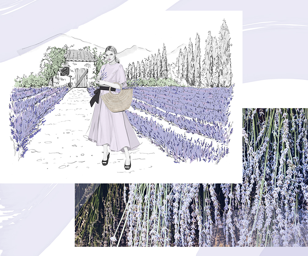
PURPLE - The Provençal flower farmer in a rolling Lavender field.

VANITY

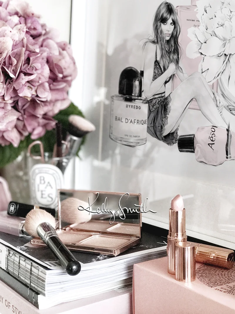

I had originally intended this piece to be something of a throwback to my 2009 illustration 'Scented' - one of my most popular prints ever - a 'Scented 2.0' if you will.
It quickly evolved, however, into more a still life featuring some of my favourite beauty products; scented in more than ways than one!
Aesop's 'Resurrection Aromatique' hand balm, which smells so delicious I could eat it, is also secretly used by my husband (I'm a regular ol' wikileaks over here!)
My 'Baies' candle from Diptyque has long since burnt out, but using it as a vase for the most fragrant of peonies is another way to admire its beautiful design.
Also featured are Charlotte Tilbury's 'Very Victoria' - hands down the best nude/beige-rose lipstick - and Chanel's 'Coco Mademoiselle.' I find so many Chanel perfumes too strong for my senses, and as much as I would love to say I was a fan of the iconic 'No.5' it's just too overpowering for me. 'Mademoiselle' is by far my favourite; powdery and soft, but also a little bit sexy.
My other go-to is BYREDO's 'Bal D'Afrique.' I first discovered BYREDO a few years ago while browsing the beauty department at Liberty London where I was immediately seduced by the edgy beauty of 'Rose Noir' and wore it, quite literally, every single day until it ran out. When I popped into a store to re-purchase it I tried 'Bal D'Afrique' on a whim, and I jumped ship faster than you can say 'WRAP IT UP, WENDY!'
As you can see from the image above, although not featured in the illustration, I am also a huge fan of Charlotte Tilbury's beauty products. I was converted on a visit to their counter when I purchased ol' Vic and was given a few samples of 'Magic Night Cream,' which is one of the best products I have used for my skin - and even better, it can do its thang while I sleep!
I also use CT for my brows, lashes, and even my highlighter/bronzer combo. ALL OF THE THINGS.
Anyway, none of this is sponsored, just heavily endorsed by my face and skin!
I do hope you enjoy this latest illustration, along with a peek at what's on my vanity.
It did start out as 'Scented 2.0' I promise. But what's a CT lipstick and classic white peony between friends?!
'Vanity' is available as a limited edition print in my store here: www.birdyandme.com.au/shop
REDKEN VOLUME ESSENTIALS


Illustrations for Redken 5th Avenue NYC 'Volume Essentials' Spring 2017 promotion.
L'ORÉAL


Happy New Year!
I'm back at my desk and kicking off the 2017 posts with some recent work for L'Oréal Paris and their 'Root Cover-Up' product using pencil and ink to create a glorious mane of flipped over curls with just a hint of grey.
I thought it'd be fun to show this one as an animated gif. Greys - no greys! Magic!
CINDERELLA
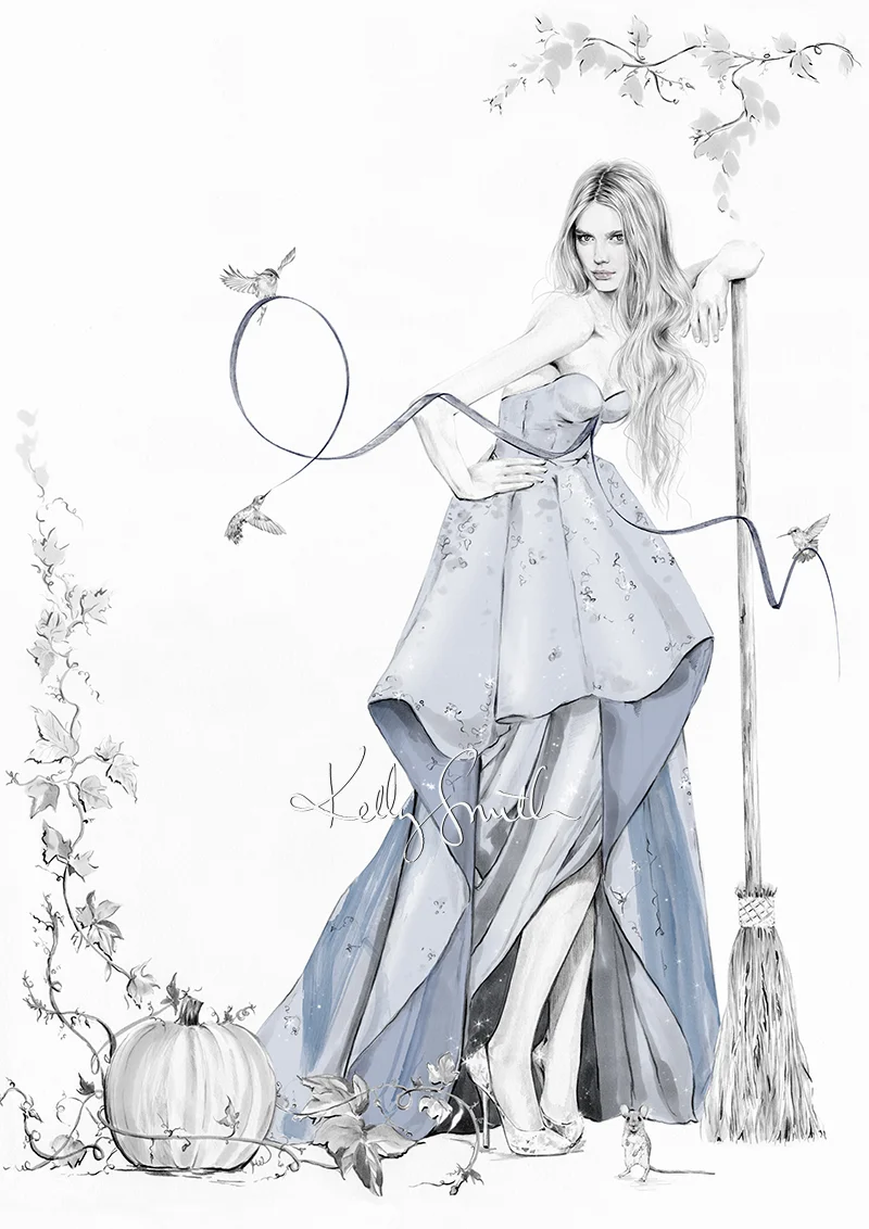

The latest in my fairy tale series, and perhaps one of the most widely treasured - 'Cinderella'!
For so many of us, 'Cinderella' (told by the Brothers Grimm and, perhaps most famously, Charles Perrault) is synonymous with Walt Disney's classic animated film. Along with 'Snow White' it was one of the studio's very first in a long line of fairy tales.
We're so familiar with that 'Bibbity Bobbity Boo' scene, the stunning score, and that beautiful scenery (envisioned by the wonderful concept art of Mary Blair).
While Disney's version is so vivid in our memories, I wanted to focus less on the ball and the Prince, and more on Cinderella herself.
Of course those shoes makes a precious cameo, but it's all about that glorious gown and the transformation from rags to ravishing beauty. The birds and mice are getting her dressed and she's just about to throw that god-damned broom away.
In true fashionista style, our Cinderella proves that sometimes all it takes to improve your day is a killer pair of heels and a beautiful dress! Sure, you might have to sweep a few floors, but you'll feel pretty darn good doing it.
'Cinderella' is available now in a limited edition of 40 A3 prints, and 15 A2 prints, in my store here:
www.birdyandme.bigcartel.com
I hope I've done her justice!
PÉRSONA COSMETICS
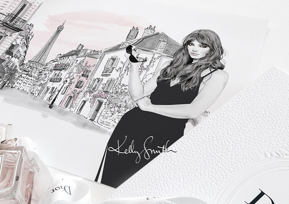


Image via Simply Sona / Pérsona Cosmetics

Image via Simply Sona / Pérsona Cosmetics

Image via Simply Sona / Pérsona Cosmetics
Earlier this year I worked on a beautiful project with make-up artist, beauty blogger and all-round cosmetics aficionado, Sona Gasparian, on an illustration for the packaging of the very first product in her JUST LAUNCHED cosmetics line, Pérsona.
Readers, and beauty enthusiasts alike, may recognise Sona from her insanely popular make-up tutorials on YouTube and her website Simply Sona.
It is always best to read about any Creative's passion project in their own words, so I highly encourage you to visit Sona's post about Pérsona here: www.simplysona.com
Taking inspiration from the city of Paris, the illustration for this product had to convey the idea of its namesake 'Identity Palette' and the way that we can transform our look through make-up, especially when adapting to new surroundings. For this eye-shadow palette and its warmly smoky, metallic hues, the brief was to create a mysteriously alluring French beauty. In true Gallic fashion, our girl has a look that is both effortless and natural, yet striking and seductive at the same time.
Needless to say that it was such a lovely job to work on, and I send Sona so many congratulations on such a huge achievement and I'm excited to see what comes next!
These gorgeous eye shadow palettes can be purchase via the Pérsona website here: www.personacosmetics.co
HYFASHION AT GRAND HYATT MELBOURNE


HyFashion Stationery Suite, photographed by Gemma Watts

Brooke Meredith in Con Ilio for the Grand Hyatt Melbourne, photographed by Neiyo Sun
I recently had the honour of working with the incredibly luxurious Grand Hyatt Melbourne on their Spring fashion campaign, HYFASHION, in collaboration with Australian designer, Con Ilio;
celebrating the iconic beauty of the 'Paris' end of Collins St, Melbourne's premiere shopping precinct, and home of the hotel.
Incorporating the stunning pink 'Charlotte' gown with its hand embroidery and signature camouflage print designed by Con himself, we wanted to create the image of a bold and confident woman; the personification of Melbourne's celebrated fashion and design scene.
As a huge fan and admirer of Haute Couture, working with a designer championing the very specific and intricate methods of creating such gowns was a dream.
During the course of the promotion, guests can book a very special 'HY FASHION' package which includes, with a luxury stay at this beautiful hotel, an exclusive stationery suite (designed by me), High Tea for two in Collins Kitchen, and a one-on-one consultation with Con Ilio.
To book a stay at the Grand Hyatt Melbourne visit the website HERE.
THUMBELINA


I can't describe how inspired I was by last week's visit to the Viktor & Rolf exhibit at the NGV in Melbourne.
One gown in particular struck a huge cord with me, along with this quote the boys had left on the wall at the exit;
"We design clothes that look like they were made by the birds in Cinderella."
UM, YES!
I feel like this idea encapsulates everything that is so whimsical and beautiful about fashion - and, in particular, Haute Couture.
These gowns are less about wearability and so much more about the fantasy of a character or mood, lending themselves so beautifully to that sort of suspension of disbelief we adopt when we read our favourite fairy tales. Which is exactly what I'm trying to achieve with this series of work.
Currently working my way through my favourite childhood stories, that quote paired with the stunning ribbon gown from
Viktor & Rolf's 2005 'Flowerbomb' collection really resonated when it came to my next effort - 'Thumbelina.'
It's probably quite clear to everyone how much the story and concept of 'Thumbelina' influences my work - just in my approach to scale, alone!
So, when tackling my illustrated version of this little lady I wanted to bring her into the world of fashion and have her 'mother' be a Parisien dressmaker; one who would create a gown for her from scraps of fabric and off-cuts from the floor.
Of course this particular gown was unbelievably fitting to my idea and as soon as I saw it in the exhibition I knew it was The One.
The mouse is also a nod to one of my childhood heroes, Beatrix Potter. After all, the mice in the building would no doubt help Thumbelina's mother stitch this beautiful gown!
I think this has to be my new favourite of the series <3
See more 'Thumbelina' inspiration below: